The SDSU LGBT Resource Center (Pohlert)

This flyer is for the proposed SDSU LGBT Resource Center to be located in the Student Services building. It is meant to create a safe place for people in the LGBTQ+ community and provides networking and library resources. The proposed plan has a blueprint on the back of the flyer to provide a visual aid for the center and engage the intended audience. It is pretty interesting to see that the Pride Center is the current LGBT Resource Center and located farther from campus by Campanile Walkway. The proposed plan seems to be a better resource center because it would be in the Student Services Building and be bigger than the current Pride Center. I feel like not too many people know where the current Pride Center is because it is in portables and not centrally located on campus.

tGLFoSD: Political Campaign Night (Rogers)

The 1972 Gay Liberation Front of San Diego Political Campaign Night flyer is festive, informative, and red. Proudly displaying two eagles (or are they seagulls?), this event invited the general public to attend a night of discussion and speakers from most major political parties of the time. There was someone from the Republicans, Democrats, the People’s Party, and a socialist party. The American Independent Party apparently declined to come.

The event was to be held at a Methodist Church near SDSU in mid-September. It was hosted by the Gay Liberation Front and admission was free. There is an address for the church, a postal box for the GLF, and a phone number for the Gay Information Center.

Review: “Canada’s Year Without Summer” (Cassell)

http://niche-canada.org/yearwithoutasummer/

The use of maps, locations, and/or quantitative methods in posing, visualizing, and investigating new research questions pertaining to myriad humanistic disciplines.

  1. Impacts of cataclysmic and climatic events are mentioned in geospatial terms. The project is therefore spatialized in its mission, but its application could be improved. The project fits within our definition, because it uses locational differences to analyze the understudied topic of global weather patterns and how various people reacted differently based on region. The definition cites the use of maps first, but overall location analysis remains the crux of Spatial Humanities.
  2. Spatial parameters are explicit in that the site specifically discusses a global and regional weather variations and reactions. The organization of newspapers and other documents implicitly relate the regional differences of Canadians. The project organizers also make important claims regarding differences between urban and rural communities in response to the climate shifts.
  3. The project’s objective is to inform readers about impacts of climate in myriad related topics (food, farming, charity are mentioned on the home page). Overall, the goal is to boost general knowledge of climate history.
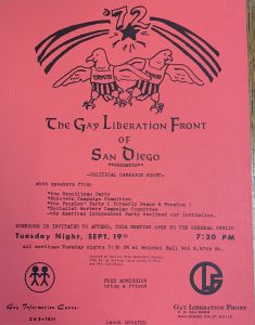
  4. The intended audience includes “teachers, history nerds, weather geeks, Canadians, online trolls, everybody…” and specifically addresses goals and objectives for each group.  It lays out specific questions to ask, encouraging a climate of research and classroom-oriented interpretation for both younger and older students. The surplus of colloquial language implies an audience of middle or high school students, though, and could dissuade scholars at the collegiate level and above.
  5. The user interface is helpful and spatially-oriented, but dominated by links rather than visualized spaces.  Sources are listed clearly based on geography and in alphabetical order. There is a helpful “Whys and Hows of Using this Site” page that gives people who may be less familiar with digital projects the ability to accurately utilize it. Critically, though, there is no direct mobile site. When typing the URL into a mobile device, it brings you to the larger department website for “Niche-Canada” and not the actual project itself. Each primary source is also transcribed which helps those who cannot read the source’s small print or handwriting.
  6. The project is lacking in maps. Those unfamiliar with Canadian geography can be thrown off or incapable of garnering a distinct picture of what the author intends to illustrate. Maps and other visual aids often help readers connect events in a way that words cannot, and they would be an invaluable addition to this particular project. Maps of global air currents, average temperatures, and historical agricultural output would be particularly useful. There may be additional language barriers, assuming a great deal of users are French-Canadian, and there doesn’t appear to be a method to toggle between languages.
  7. This project is useful in conveying historical and spatial knowledge, but there is clear room for improvement. The collection of periodicals, diaries, newspapers and government resources allow more users to engage with material and provide materials that a library cannot. The mission statement on the homepage makes it more effective than a few other collections as well. One ineffective presentation element is the use of grossly informal language (i.e. internet trolls be nice). It renders the work far less credible than it could be. While the spatial argument itself is credible, some of its presentation detracts from the overall experience.

Rubric:

4 – Project demonstrates mastery of spatial methods and clearly utilizes plentiful maps, models, and other visual and/or quantitative aids to advance existing historical questions and raise new ones. Interface is accessible and easy to use, even for those with little technological background. There is a clear and concise goal for the project rather than simply a collection of documents.

3 – Project demonstrates above average use of spatial methods and has some maps, models, or other visual aids to assess historical questions, potentially not raising new ones. Project might use location based pages or texts clearly, but does not use maps for assistance or as a tool. Clear interface that may or may not be easy to use but has some type of “How to” page. There is a goal stated, although not explicit.

2 – Project demonstrates some use of spatial methods, but has few to no maps, models, or other visual aids and does not accurately assess scholarly questions. More documents than analysis or engagement. There may be some inconsistencies with interface. There is a goal stated, but it could use improvement. Project authors do not fully elucidate spatial purpose.

1 – Project demonstrates no spatial methods, and it has no maps, models, or other visual means. Simply a collection of documents. Difficult to use interface. No goal, purpose, or mission statement. Spatial aspects ignored or disregarded.

Review “Histories of the National Mall” (Campbell and Haylings)

http://mallhistory.org

Definition of Spatial Humanities: It’s the use of digital analysis tools for the academic community to explore and interact with the relationship between place and humanity.

  1. The History of the National Mall project uses tools acceptable to our definition of spatial humanities. The use of maps, the inclusion of source citations, short descriptions of event/subject, and good categorization to connect events/subjects, provides an interactive space for visitors to have a variety of experiences.
  2. The site makes a fairly compelling and explicit spatial argument in relation to the significance of the National Mall as an historical space. The design of the map and the placement of the individual entries within it through the use of geotagging connects the documents and events to a real space. The details in entries like “The Klan Walks in Washington” give physical dimensions to aspects like crowd size, while giving context to the reactions of observers, making the space feel real. Furthermore, the Exploration section provides more expansive coverage of the development of the space of the Mall with further examination of the changing physical designs of the monuments it contains.
  3. The objective is to provide a user-friendly map that allows participants to easily research the National Mall ahead of time or during a visit. The quantity of information and subjects is not overwhelming, although it would be more than a day trip to visit each reference point.
  4. The intended audience of the site seems to be more on the general side, non-academics with an interest in American history and the history of the Mall itself. The drag and click style of the map seems well suited for tourists to use while visiting. The site provides a  good overview and some specific details that would work to satisfy the curiosity of amateur historians. Professional historians could make use of the sources as up to date citation information is provided, but it does not seem to be meant to function as a primary research archive.
  5. The interface is very inviting with clear links and headings that help direct you around the site. The look is quite attractive and the map, a central feature, works well and is easy to navigate. There is a difference in how the interface functions based on what device is being used to access the website. It seems more tailored for touch orientated devices like phones and tablets, as navigation is somewhat clunkier on a standard desktop computer. The site feels geared towards being used in the actual space of the Mall.
  6. Nothing obviously needs to be removed, but in terms of additions, the site could benefit from providing a different experience for those on a traditional computer. The Exploration section does a fair job of this, with longer, more expansive entries on particular questions, but the effect of the map seems to be a little lost if one cannot follow it while visiting the Mall. A 3D rendering of the map could prove beneficial for those who cannot make the trip.
  7. The Histories of the National Mall project is quite useful for a visitor hoping to get a more than a few photographs at the mall. The website conveys the history of the mall through a user-friendly map, which shows the significance of each location. Because the site does not have a “Best of” section, it forces the user to interact with each location on their own rather than taking a guided tour. This enables the user to make discoveries in the place they are present, which helps the spatial argument of this project.

Review “The September 11 Digital Archive” (Del Nagro; Rogers)

http://911digitalarchive.org

“Spatial humanities is the transformation of digital humanities, in which the humanities underwent the application of computerization over the last twenty or thirty years, to create new digital or computerized “maps” or renderings of the richness and diversity of the human experience.”

  1. We would change the website to better spatialize the resources by adding more maps and 3D renderings, as well connecting bios, photos, and personal testimony to the victims’ and survivors’ locations both in the New York area and within in the buildings. Who were they? Where did they come from? (Not every victim was American.) What did they do for a living in the Twin Towers? As presented, this site does not match our definition of spatial humanities because it lacks a social justice dimension. It is not speaking for anyone, in particular, especially the victims, and in particular the working class victims.
  2. We feel that at present the site is not very useful because it leaves the reader feeling disconnected from the event. It mostly represents the impact on New York City and upon the nation’s prestige more than on those who suffered, both the surviving heirs and the victims. A site like this could benefit from drawing the viewer into the world of 9/11 and its aftermath.
  3. The objective of the website is to “collect, preserve, and present the history of September 11, 2001, and its aftermath.” What is entirely missing is the determination of the arbitrator, Kenneth Feinberg, to apportion to the heirs of some of the dead more in compensation than others. Why was this determination of inequality made? Was not every person killed equally valuable to society? Who is to say they were not? Why does someone working in corporate receive more value in compensation in death than the janitor in the Twin Towers? Spatial humanities would be more accurate to our definition if it pointed out this discrepancy and asked why we as a society tolerated it. Is not everyone equal in death? Did not everyone who died make a sacrifice?
  4. The intended audience is the general public, but it does not learn much it does not already know.
  5. Our impression of the user interface is that it is not too involving or exciting. It appears to be mere tabular lists with little emphasis on a cohesive theme. We do not see any theme except a view of once-impressive knocked-down buildings.
  6. We would add much of what we stated above. This feels like a website from 2001, and there is so much more that could be done now to engage viewers, especially considering the number of primary sources available almost two decades later.
  7. The website is not useful in using digital technologies as much as possible in ways that speak for disadvantaged victims and their next of kin. It is more a repository of media files which are hard to access. There is little to no use of spatial humanities (there is not even a map).

Railroads and the Making of Modern America (Pohlert and Ali)

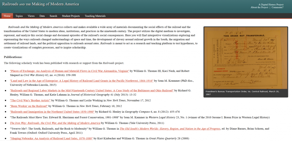
Review of “Railroads and the Making of Modern America”              by Pohlert /Ali

Spatial humanities is a field of study that uses technological tools and mapping to analyze human culture, especially focusing on minorities and their outlook on history.

  1. The site is spatialized very well. There are different categories and sections to help navigate the website. There is also a search engine specifically built for the website, which allows people to narrow down their results. It fits loosely into our original definition, but can be changed to include mapping as an important part of spatial humanities.
  2. We see an explicit spatial argument of the interface not being intuitive. The homepage could be organized differently, in a way that makes a more interactive interface. The format of the homepage could be reorganized. The sections/tabs could be turned into side tabs that show previews of the information. An implicit spatial argument in regards to the visual interactive components being difficult to find when they are very useful tools within spatial humanities.
  3. The purpose of the website is to show the history of American railroads, acting as a “research and teaching platform for scholars to test hypotheses and create visualizations of complex processes”. It’s a digital project online from University of Nebraska – Lincoln made graduate students with open-access to help researchers use railroad data.
  4. It’s intended mainly for students conducting research on railroads and other scholars who focus on histories related to the railroad system. It’s also intended for teachers for its tab ‘teaching materials’. Another audience would be families who have ancestors who helped build or lived/died through enslavement and the railroads being built.
  5. The user interface is simple and straightforward, but can be improved visually. It’s slightly cluttered with links. The ‘views’ tab could be renamed to ‘visual aids’ or ‘visual photos’ to establish a better way to move around the website.
  6. The data section could be improved with embedded visuals of the data. The website could also be modernized. It would be more helpful to have the hyperlinks embedded under helpful words, rather than labeled out in a boring, cluttered manner.
  7. We see the website as being quite effective at conveying historical and spatial knowledge, but it could improve its use of digital technologies. The search engine and interactive maps are good uses of digital technology. The visual maps are hidden, so we argue that the website could make these great uses of digital technology more easily visible and accessible.

Review of Arcadia Explorations in Environmental History (Schumaker and Norton)


Spatial Humanities – Spatial humanities is an aspect of digital humanities that helps us understand human activity and how space defines the human experience.

  1. To further spatialize Arcadia and fit the project into this definition of spatial humanities, the articles that the markers on the map link to need to include more of the human experience, such as oral testimonies. These articles could also include regional maps to show other environmental events in the region, because environmental events are so often connected. It could also be further spatialized by putting the map front and center, instead of off to the side. Additional photos or videos of the region accompanying the text would also provide a clearer digital component. While our proposed definition is rather broad, we would not modify it. There are many ways to define spatial humanities, and it is also a field that is still working toward finding its own identity. Spatial humanities may be defined in different ways by different people and different fields, as we discussed in class.
  2. This website’s argument for being a spatial humanities project is implicit. The site uses rather simple and straightforward methods to present the data for different environmental events. There are few layers of depth to the project, and it does not reconstruct or demonstrate space in ways other than dots on a map and a couple photographs.
  3. The intention of the site is to promote accessibility and visibility of the relation of environmental histories to nature and human society through short publications, and provide short, engaging environmental histories for informed conversations on environmental events.
  4. The intended audience is the general public.
  5. The user interface has an overly simplistic appearance (very blog-style) that makes it difficult to see what all the website has to offer. To really get the full effect and scope of the information the site has to offer, you have to click on the map in the right-hand sidebar, which is hidden unless your internet browser window is fully expanded.
  6. We would like to see oral histories (for the more current events) to understand how the space that people occupy influenced their experiences through these environmental events, as well as a greater emphasis on the world map instead of blog posts. The map should be a more central component of the project. We would also like to see more maps included inside the blog posts.
  7. The site does include historical and spatial knowledge, but it emphasizes the historical aspect more than the spatial aspect. The site could focus more on the map to highlight how these environmental events are connected. However, as a historical site, Arcadia has many opportunities for improvement. Since history is based on people’s actions and reactions to their surroundings, Arcadia should include more personal testimonies, such as oral histories. The website fails to connect people to environmental history, which may be more indicative of the field than the website. Arcadia should be able to demonstrate the influence that people have on the environment, and vice versa.

Project 6 “Great Unsolved Mysteries of Canada”

Group #6 by Albert Contreras and John Gove

Explore and Review:

“Great Unsolved Mysteries in Canadian History”


  1. The murder scene provides the best access point to creating a spatial study for the website. We could use the primary source documents to visually recreate the scene. Our website relies solely on text and offers no 3 dimensional space. We would not adjust our definition after interacting with this site.
  2. The site is making an argument that this experience mimics the experience of a historian actually visiting an archive.
  3. Getting the public engaged in primary source documents in an accessible way. The categorization of the primary sources in a logical manner makes it less intimidating.
  4. The intended audience is likely teachers, students, and the general public who has interest in history.
  5. At first glance the interface seems kind of annoying and archaic, but when you take into account that it was created from 1997-2001, it actually looks pretty good. The photos are kind of low quality, but overall not bad.
  6. The website needs to add a “next” and a “previous” button. Actual images of a select number of the primary sources could provide a visual component. Adding 3D or more complex images would also add to the experience. Not really anything that we would remove.
  7. The site uses digital technology to convey historical knowledge very well. There is a lot of information, both primary and secondary sources, and the format is accessible. It doesn’t convey spatial knowledge as well, but this is probably due to the technological limitations of the time it was made.


Site Review:

This site uses text and images to recreate the experience of a historian researching primary sources in an archive. By doing the organizational work for the user, primary source documents are now available to students who lack the skills necessary otherwise. The user is asked to “solve” a murder mystery by examining the primary sources. The murder is placed in the historical and regional context at the time of the event. Students are encouraged to delve into a time and place they may be unfamiliar with. The site is likely used for classrooms, where students can create profiles and interact with the documents with the end goal of solving the mystery.  By creating their own interpretive essay, students are essentially creating a secondary source document from the provided primary sources.

The site has a lot of potential, but is limited by the technology of the time it was made (1997-2001). The images are not high quality, and there is no interactivity. The color scheme is a bit bland for a website geared for young students. We also feel that there lacks an overall cohesion between the links provided. The “choppiness” of the website would be alleviated with more buttons. The user would be assisted with a short video that could frame the overall goal of the website and the desired final outcome.Given additional funding and work on the site it is easy to imagine the website could provide even more information and interactivity, and so could be an even better teaching tool. Overall the site is very informative and provides a great deal of information, images, etc. It is likely a very effective teaching tool as is, but needs an update.