http://911digitalarchive.org
“Spatial humanities is the transformation of digital humanities, in which the humanities underwent the application of computerization over the last twenty or thirty years, to create new digital or computerized “maps” or renderings of the richness and diversity of the human experience.”
- We would change the website to better spatialize the resources by adding more maps and 3D renderings, as well connecting bios, photos, and personal testimony to the victims’ and survivors’ locations both in the New York area and within in the buildings. Who were they? Where did they come from? (Not every victim was American.) What did they do for a living in the Twin Towers? As presented, this site does not match our definition of spatial humanities because it lacks a social justice dimension. It is not speaking for anyone, in particular, especially the victims, and in particular the working class victims.
- We feel that at present the site is not very useful because it leaves the reader feeling disconnected from the event. It mostly represents the impact on New York City and upon the nation’s prestige more than on those who suffered, both the surviving heirs and the victims. A site like this could benefit from drawing the viewer into the world of 9/11 and its aftermath.
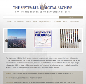
- The objective of the website is to “collect, preserve, and present the history of September 11, 2001, and its aftermath.” What is entirely missing is the determination of the arbitrator, Kenneth Feinberg, to apportion to the heirs of some of the dead more in compensation than others. Why was this determination of inequality made? Was not every person killed equally valuable to society? Who is to say they were not? Why does someone working in corporate receive more value in compensation in death than the janitor in the Twin Towers? Spatial humanities would be more accurate to our definition if it pointed out this discrepancy and asked why we as a society tolerated it. Is not everyone equal in death? Did not everyone who died make a sacrifice?
- The intended audience is the general public, but it does not learn much it does not already know.
- Our impression of the user interface is that it is not too involving or exciting. It appears to be mere tabular lists with little emphasis on a cohesive theme. We do not see any theme except a view of once-impressive knocked-down buildings.
- We would add much of what we stated above. This feels like a website from 2001, and there is so much more that could be done now to engage viewers, especially considering the number of primary sources available almost two decades later.
- The website is not useful in using digital technologies as much as possible in ways that speak for disadvantaged victims and their next of kin. It is more a repository of media files which are hard to access. There is little to no use of spatial humanities (there is not even a map).