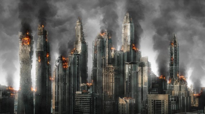
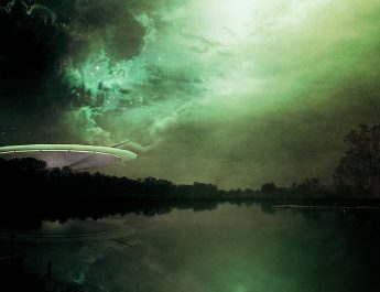
For this comic, I chose to focus on the feelings of Rye through color and abstraction. I tried to use as few words as possible to mirror her illiteracy in the story. As this story had very little dialogue, I was conflicted in portraying events through gestures, which are difficult to do in a stationary image, or through pure abstraction, which can lead to a misinterpretation of the focus on the panel. Throughout this comic, I want to establish a pattern of connecting images and emotions together to parallel the idea in the story that even beyond written or oral language, people can still collate and develop relationships around emotions.
In this first panel, I wanted to make the connection between identity and emotions in Rye through color theory and illustration. Here, I focused on the face of Rye and the emotion of fear. Within the context of fear, I wanted to focus on why she was afraid in the first part of the story on the bus. I tried to express that through the textures of blue that outline her face, showing that not only did she feel afraid, but that fear, in the moment, defined who she was. This can be easily seen on Page 2 as, in response to the fight and seeing Obsidian for the first time, her first instance was to step back, to remove herself from the tension and uncertainty of the situation. “The bus did not move, but Rye moved away from it.” “Rye took another step back from him.” I felt that tension, uncertainty, and anxiety were all aspects of that fear. Additionally, I wanted to emphasize her feelings at the time so I surrounded her face with the word “fear.” This is a technique in certain Japanese Manga but is used with an onomatopoeic word. All of these techniques were used to create the connection between self image and emotion in Rye at the beginning of the story.
For the second panel, I wanted to highlight the scene where Rye shows where Pasadena is in a map to Obsidian and the emotions attached to this interaction. In this panel, I wanted to use color theory to show the green envy Rye had regarding Obsidians apparent ability to read. “He could read, she realized belatedly. He could probably write, too. Abruptly, she hated him—deep, bitter hatred… No person still living in what was left of human society could fail to recognize that expression, that jealousy.” Additionally, the haze above the map highlights the uncertainty Rye had in determining where Pasadena was despite her living in the Los Angeles Area for decades. I chose to label Pasadena because even though Rye could not read in the story, Obsidian could and this ability was the basis for her jealousy. As in the first panel, I wanted to frame the panel with an explicit emotion. I chose to position the japanese word “羨望”, meaning envy, around the frame. I chose japanese for two reasons: first, it is a language that most people are not familiar with but it still conveys an idea or emotion. In the same way, Rye cannot read English anymore but still acknowledges it as powerful because of its potential to express meaning. The second reason was because of the etymology of “羨望”. The first character means envy but is expressed with the combined characters “sheep” and “saliva” like a drooling animal looking at food. The second character can mean to gaze upon. Of the words that can express envy, I felt that this was the kind of envy Rye was feeling, like an animal looking at food and drooling. In this panel, we begin to see the development of a relationship between Rye and Obsidian through image and emotion in color. This specifically supports the pattern I wanted to establish that beyond “conventional” kinds of communication, people were still able to develop relationships with each other after the epidemic.
In the third panel, I wanted to focus emotion and illustration into a single drawing. This panel shows a chalk outline of a body like those historically used to outline a deceased, especially in a murder. The last scenes of the story center around the altercation between Obsidian, the angry man, and the running woman. Even though it looks like there is one outline, there are actually several which are almost superimposed on top of each other. The color of red represents the blood of the three deceased. The black and red contrasts further highlights the overall atmosphere of the story in it being dark and depressing. In opposition to the vibrant colors in the first two panels, the muted red was chosen to signify the loss of life and the loss of hope for Rye. The chosen textures as well, being broken and jagged, also lends in creating a feeling of falling apart. I wanted to focus on the simplicity of this panel because in the perspective of Rye, all she could see were three dead bodies in front of her. The connection in regard to relationship and emotion is shown here with the red representing anger and a loss of connection with the single image depicting her focus at the time. The dead bodies in isolation to the environment and use of color theory evokes a sense of draining of life Rye felt both emotionally and physically in the loss of Obsidian.
The final panel took a step back from looking at relationships between individuals and took a macro perspective to the end of the story. As a result, the fourth panel was a major deviation from the first three. Rye’s realization and perspective shift of the world after learning the children could speak was the main inspiration for this panel. The first distinction was the color of yellow filling the panel, a stark contrast to the dark colors and black that was expressed beforehand. The choice of not blocking the color yellow was to express the persisting uncertainty of the situation but one with a sense of direction and hope. “She had kept herself alive when she had no reason to live. If the illness left these children alone, she could keep them alive.” This last scene could be seen as a revival of Rye as a character and society as a whole. In this moment, she both found a purpose for her life as well as hope to continue as a civilization. The image in the middle is an image of a soundwave that says “hope”. I spoke the word into an audio program and this was the visual representation of that sound. Here, I wanted to highlight Rye’s illiteracy but also draw attention to her and the children speaking amongst themselves and the hope for civilization it represents. In this way, I connect back to my idea of language as emotion instead of “conventional” language. I felt no further clarification was necessary as I wanted this scene to prompt the question of, “what does this soundwave sound like?” in the minds of the reader. I hope that if the reader is familiar with the story and think about this panel, they can come up with the word “hope” or words like hope which signify the bright future for Valerie Rye and the children.
For my comic, I used Photoshop to create the comic and Audacity to create the visual soundwave. As this story involved very few words spoken, it was both an inspiration and a challenge to convey what was happening in image form. I did not feel confident enough to illustrate gestures, so I focused on using color and abstraction to illustrate the feelings that were present for Rye throughout the story. This was challenging as it took a while to come up with what to focus on in regard to abstraction and concrete expression. Once I had an answer, the process of translating that from an idea onto the image was straightforward. I felt that the successes in this translation from story to comic was mainly rooted in the details I chose to provide. However, the fact that I chose to pursue abstraction over clear depictions of events can lead to misinterpretation or confusion.


